Monthly Archives: April 2023

Prototype puzzle matching velocity target

I have improved my prototype to include a puzzle targeting one learning objective.

Former version allowed the player to drive all over the city and mountain but did not have a specific learning objective covered.

For this version, the player has to match the car’s velocity arrow with a defined target.

The learning objective is to explore both components of the velocity vector, its direction and magnitude. The vector is displayed as an arrow.

The target for this first puzzle is: direction North, speed of 10 km/h
Arrows displayed on the ground replicate the desired vector target.

The GUI shows real time data.

The car is already placed in the test corridor and set in “Test in Progress” mode.
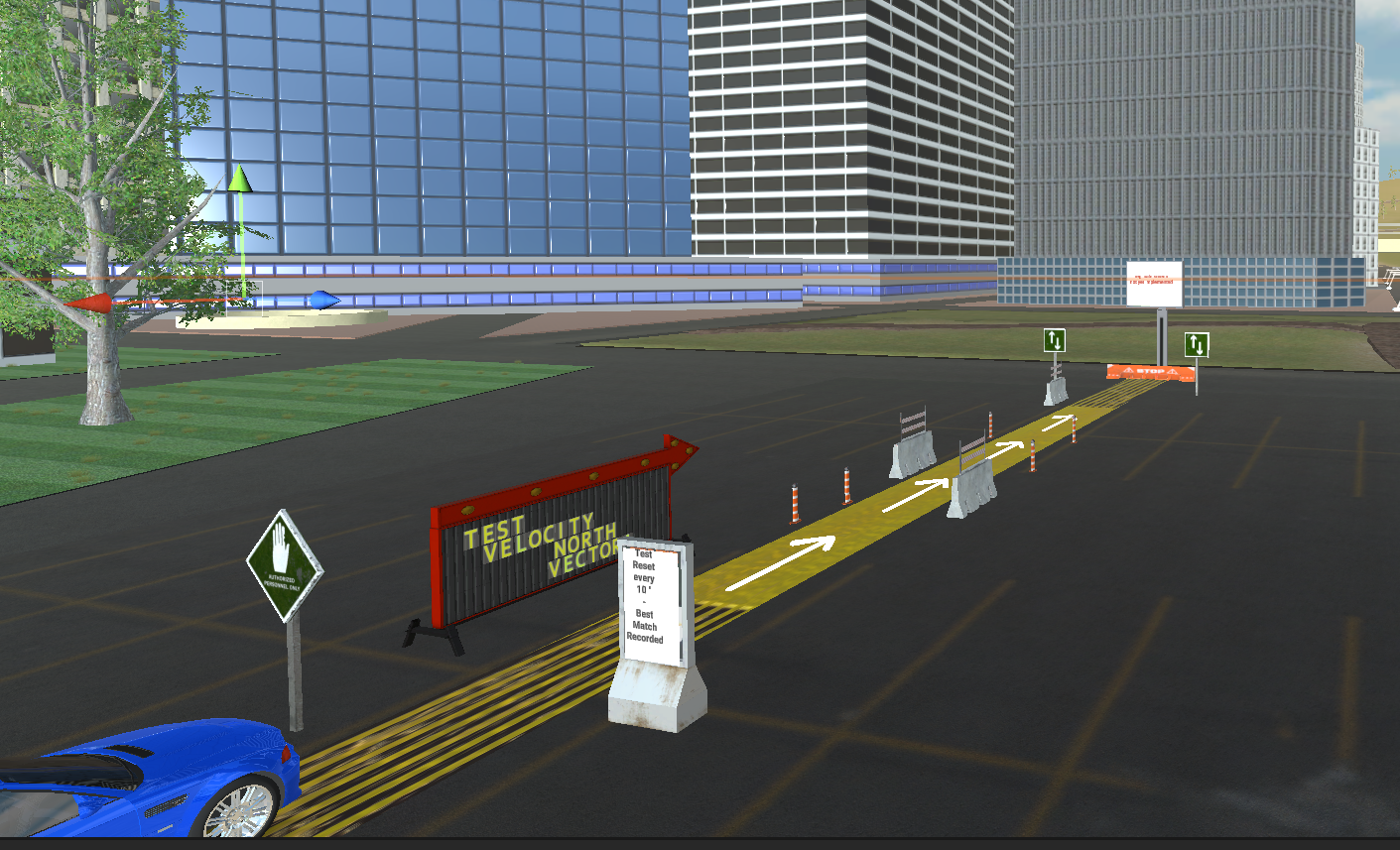
Puzzle Mechanics:

Countdowns of 10 seconds allow the player to test the car’s motion and look at the accuracy of the match in percent.

As a player you drive the car using the usual keys  and try to match the target.

Every 10 seconds the overall accuracy score is updated.

If accuracy is over 90%, the test is passed
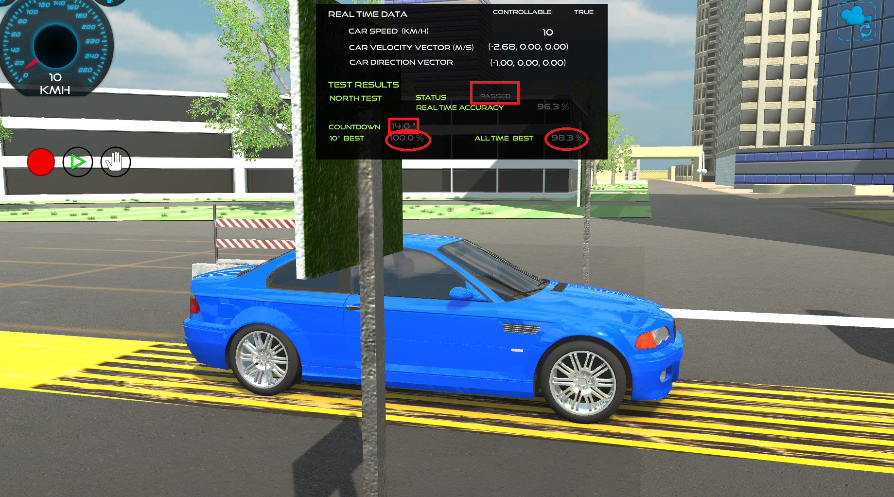
Above, the test was passed with 98.3%. A new attempt is in progress and has reached 100%. At the end of the current countdown the all time best will update to 100%


Prototype URL:

Windows version download at: https://kay6.itch.io/engineer-your-way

the zip file is provided. Please download, decompress and run the .exe file. The app will open fullscreen. Close the window to stop the app (best to launch with 2 screens)

WebGL builds have failed not sure why. I am investigating

What is missing/Not yet included/Known issue:

  • A compass that is also showing the relationship between North and the coordinate system. For now, Vector coordinates are provided in (x,y, z) format. The direction North is the vector (-1,0,0). Speed is converted from m/s to km/h using factor 3.6.
  • Detecting the location of the car to initiate the “North Test in Progress” mode.
  • Figuring out how to calculate accuracy when a player uses the reverse gear and other conundrums with other possible directions
  • Update the on site board to show a big progress status
  • Create graphics special effects and improve data display.
  • There is an issue with the weak brightness on the GUI I have not been able to solve yet.
  • Best match created by the player could be displayed as an arrow on the ground with the corresponding location on the ground
  • There is no end to the puzzle, no time limit? A player could replay to reach 100%.
  • The test is too easy?
  • menu is not presented to explain the keys to use


level 4 posts and discussion

Discussion

Describe your Process

  • Describe your process used over the 6 week period to design your team’s game/simulation.
    • What did you work on specifically?
Following guidance from the course, I was able to iterate many elements of the game. 
I also developed and iterated with my prototype.
I used professional tools to keep track of my iterations and progress, such as version control.
I think without these tools things can get messy pretty quickly.
I also posted most of my work and feedback in my blog (see below).

Reflect on your Process

  • What was successful/not successful?
  • If you could start over, what would you change in addressing the project?
I was successful in making the game evolve and getting a better story, design puzzles that are meaningful for learning.
I was not successful in getting interesting feedback from a researcher I contacted. 
But I did receive great feedback from Danielle. 
I have not been able yet to fully integrate all feedback in my game design. 
It is a busy time of the year at school but I will have more time starting next week.

New Content

  • What new content within the Level was helpful to you as an individual designer?
Knowledge challenges were fantastic to tackle and reflect about. 
I also liked the choices of games to play.

Level 4 posts:

Level 4 Assessment Plan

GameStorming with Purpose and EDI discussion

discussion about motivation and engagement


discussion about hidden mechanics


level 4: Concept Testing and Feedback Summary


Level 4 Client LIVE Communication


Level 4 Team Notes Design Process


Final assignment (PDF file):

TO DO: ADD with feedback and notes


GameStorming with Purpose and EDI discussion

GameStorming with Purpose
==========================

About the game persona, Game, simulation, or simulation-game, potential title, core dynamic, description of the idea, shared ideas, and references.

See my assignment PDF file here: level3-assignment-kaymo-v3

Feedback
===========

Hi Kay, your idea at this stage is well developed so I’m looking forward to seeing your exploration in 4: Gamestorming as well to see if other mechanics or elements may help build on what you have as a foundation. You have a lot of great detail included and you can find some of my notes in the rubric feedback as well. I like that you have also considered the prototyping tool you could use so you would know what was possible for you to design for. You are off to a fantastic start and as you progress I hope to continue acting as a sounding-board to help keep the project manageable as a highly complex game would be too much for one person to design. 😀

Thank you for your thorough feedback. It’s wonderful for me to benefit from your feedback and take more time in the design phase. I have used your comments to modify my blog post “4:0 Client LIVE Communication” at: https://kahinamorisset.com/level-4-client-communication-evidence/👍😀


Discussion about EDI
===================

In the Editorial by Hersh & Leporini (2018), several papers from the special issue are summarized. Select one of the summaries and explain if the authors of the summary are truly addressing the points made by Hersh and Leporini about designing for all – without losing the intent to be engaging and fun. Is the summary addressing the concerns completely, partially, or not at all and why do you think so?

Hersh & Leporini (2018) observed that some games focused on particular impairments. For example CRPBlind focused only on Blind users. The summary did not address the concerns of the authors. Videos games are expensive to develop. Project are initiated by sponsors that have some specific purpose or goal in mind. Designing for all may add a cost or require additional competencies in the design team. The scope of the project may include only specific inclusive features.

Reflect on Yourself as a Learner-Player 

With modern games, I find it challenging to figure out how to move the characters and use “physical dexterity” to advance in the game. Most of the time, I have to find a walk-through otherwise, I stay stuck. The game industry wants to make you feel inexperienced, giving you an additional incentive to buy and play more games. How many games does one play, and how many hours are required to develop such specific skills per week?

I played “outbreak squad” and found the experience enjoyable. The game required listening and reading skills. The game featured easy physical interactions (mostly mouse clicks). I could figure out how to prioritize actions and use points. Overall, the game made me feel empathetic and empowered. I think the game could appeal to my “socializer”, “achiever”, and some “explorer” Bartle’s player type.

Reflect on Others as Learner-Players

I know many of my students (vocational high school) play games, often in the late evening. They are interested in something other than improving their skills in basic mathematics. Why do they value gameplay more rather than acquiring math skills that will open them to many STEM career options? Unfortunately, they are caught in a dream that can quickly become a trap.

The game industry has a lot to do to address ethics. Here is a provocative thought: does our society needs inclusive games and risk spreading even more the video game addiction?

Regarding the “outbreak squad”, I liked that Bartle’s player type of “killers” was ignored. This game could help students develop strategic thinking and leadership skills in an ethical and effective way. I was learning how to protect humanity from a threat without panicking, using all help and expertise available, doing their best to cover all, and being inclusive and aware of vulnerable people.

Response to peer:
===================

I liked that you mentioned what is pleasing for you in a game. I agree that cute characters do a lot to make a game engaging for me as well. I’m curious about the feelings of guilt you mentioned in your joke. Maybe society pressures some of us to be serious all the time and study hard?

Serious game producers assert that we could play and learn at the same time. How about a scale on the packaging? Like the age rating? Maybe a learning rating? That could be helpful for parents to get more information about a game’s learning component.

Feedback
============

Great discussion with your peers and also introducing a very real issue facing teens and adults alike – game addiction. This is very much an issue and something that constantly challenges good designs – oftentimes we have to consider how our designs could be engaging – for example too much chance (one of the particular forms of play that inherently aligns with addition like gambling). Your own reflection I think will be further meaningful for your peers as well as some are avid game players and may not think as much about the physical dexterity of modern games (which is very much an issue!).

Level 4 Assessment Plan

Players progress through the game by completing levels. The first levels focus on exploring the problems and knowing more about the tools that can be used to solve problems. The final levels will focus on using the tools to create solutions.

See more details with feedback annotation here (PDF file):annotated-assessment-plan-engineer-your-way

Additional feedback: (to be used for next iteration)

  • Very nice assessment plan, Kay! I’ve annotated notes throughout the document, so do check the annotated version out so my comments are more in-line with the different sections. You have quite a bit of progress with how you will assess and provide feedback to players which is great.
  • I would like to know a bit more about how the threshold for physics skills is determined as that wasn’t quite as clear to me.
  • I also think it may be helpful to consider the user interface (UI) as well so the feedback is visually presented in a way that doesn’t detract from the mechanics of the game – what comes to mind immediately was a “dashboard” that would be very similar to what we have in cars with all the gauges and indicators, and to use this format to embed your assessment indicators as well. (this is a suggestion however!).
  • I think in terms to role-playing, you have a well-explained role for players to assume and how you decide to carry the story will improve the role-player further. The mixing of humans and aliens strengthens the story quite a bit as well and adds more meaning to why the player is on Earth and has to abide by “Earth’s gravity and other factors!” rather than other planet’s laws of physics. This design is really coming together!

discussion about motivation and engagement

What are some ways that a game or simulation can provide player agency to increase engagement and motivation?
Your Answer:

The “Extra credits” videos provide learning experiences that are so enjoyable that I wanted to decipher a bit more about what makes my engagement go up so dramatically. Typically, I find learning videos boring. I can only watch for a few minutes. But things are different with “‘ extra credits”. For example, I watched the “quantum computing” animated video, and it gives great ideas on how characters and storytelling can positively impact the learning experience. It is written in a way that is intriguing and promotes curiosity. There are also many examples in various fields. I was surprised as I was not expecting they would talk about a subject so close to my game. The storyteller explains that quantum computers might be able to “build cities that avoid major traffic jams, with a nice “all lanes clear” road sign. Url: https://www.youtube.com/watch?v=HWxhQKo3Vh4

Links to an external site.  (Timer: 3:39). That was so inspiring. It reminded me that game designers can get ideas from so many sources, and we ought to keep our eyes and ears open to any learning experience and figure out how to translate the best ones into our game mechanics.

Many “extra credit” videos about game design, from “Choice paralysis Too much of a good thing” to “Affordances – How Design Teaches us without words” and “The price of randomness – balancing randomness” all add to the theoretical frameworks we examined in the first course. I will remember the importance of having an outstanding balance in all things, not too much but enough of the ingredients that increase engagement and motivation. The best video I found from extra credits was “The New Player experience”. There are three components, the hook, the tutorial, and the reward. All three must act quickly within the first 10 minutes so players will keep playing. Something exciting and epic, something they do and crave. My game got this part right because a player can drive and crash the car in a safe environment. It is fun. But the narrative has to be mysterious and complex, giving the player a context so they are personally invested. The video also recommends a visual hook where “your breath is taken away”.

I knew this was still a work in progress for my game, so I did a bit more brainstorming and worked more on my NPCs and the story background. They said that the tutorial is a “training run”, comprehensive enough, how to play and the rules, so they know how to play and make progress. Scaffolding can be offered as a help button for only those in need. After the tutorial, a reward must be provided to make players feel good about themselves and excited to start the game. Later, context-sensitive tutorials will come in handy. Introducing a mystery they want to tackle next could work well for my game. For example, they could explore and envision a scenery down the road for themselves. All this inspired me to iterate my storyboard and develop a more personal story to engage my players. In the process, I finally got a better idea to provide a better “win” reward. Are you curious? You can see my updated storyboards here:

New Intro: https://xd.adobe.com/view/a8d3169d-f962-4b4c-81ad-4b50cc6dcc4e-fd80/

Links to an external site.

New Tutorial: https://xd.adobe.com/view/c28597e9-0037-4494-9e71-087c4c6115c2-97d6/

Links to an external site.

New Level 1: https://xd.adobe.com/view/426110ce-9d78-4dd6-bd12-3849003b622c-1732/


Feedback

I really enjoyed the discussion of engagement and motivation. Extra Credits are a great resource and they aren’t very long which makes them ideal to pick up points quickly. The three components are always helpful with the hook, tutorial, and reward and all are dependent on emphasizing the game goal. Your updated storyboard provides some great added details and the win reward is much clearer given the complexity of the game.

discussion about hidden mechanics

In playing through the Game Play in this sub-level, what are some potential hidden mechanics that you may have come across?

As our course resource exploration page mentioned, mechanics are one aspect of the game elements that will create a “seamless experience”. Other parts, such as art, story, and rules/assessment, must fit together well with mechanics. The reading resources provided great insights into how these elements come together. Hidden mechanics mentioned in the “extra credit video” are introduced to enhance the player experience and are designed to skew things and twist the perception of our notoriously naive human psyche. Designers prevent the player from feeling things that are bad or wrong. Instead, hidden mechanics can provide the player with tension and empowerment. The designer tricks you into thinking you have an essential role and your actions matter. The game makes you feel good because your brain receives praise, enjoyment, and stimulation as you make your way through a well-designed game. Implicit rules are part of the illusion that makes a game good for players.
Looking at the “Game Play” resources, I noticed a few hidden mechanics, not explicitly given, but that made the game enjoyable. For Eve Online: the teaser mentions prosperity to attract players. I would expect the gameplay to be skewed to enhance chances of prosperity (vs. warfare) so players can receive an enjoyable taste of it. The demo says players’ alliances make the rule. It places the player agency as a primary influence toward the outcome and will empower players. As a player, you are an immortal pilot, the ultimate trick to defeat death and feel much better about our complex human condition. Ships can be customized, so you decide how to equip them. All your choices matter. You become stronger and brighter as you receive more skills (they are “injected”). You can reinvent yourself in new ways. There are so many possibilities you could replay over and over. All types of players are invited to enjoy competition, cooperation, exploring, prosperity, and even experience unlawful activities (piracy). Well, the design is done in a way that so there is no limit to what you can experience. After a while, the universe will resemble you as it is made of all your decisions. It must be hard to leave the game environment once you have invested and immersed yourself in an alternate reality like Eve. This game tricks the player’s brain so much that I find it dangerous for young minds who can get confused with their world, what powers they have, and how rules work in real life and at school.

References:

Schell, J. (2020). The Art of Game Design A Book of Lenses. Chapter 5 – The Game Consists of Elements. CRC Press, 3rd Edition. (pp. 51-59). Retrieved from: https://umsystem.instructure.com/courses/144554/files/16494569?wrap=1

de Lima, E. S., Feijó, B., & Furtado, A. L. (2016). Player Behavior Modeling for Interactive Storytelling in Games. In the Proceedings of SBGames 201611. Retrieved from:

https://umsystem.instructure.com/courses/144554/files/16494591?wrap=1

Game Analytics. (2018). 7 Incredible Game Design Examples and Why They Work. Retrieved from: https://gameanalytics.com/blog/incredible-game-design-examples/

Links to an external site.Links to an external site.

Links to an external site.

Extra Credits. (2017). Hidden Game Mechanics: Design for the Human Psyche. Retrieved from: https://youtu.be/sLXLlJ7FhJU

Very nice discussion of hidden mechanics, they are really important to keeping players engaged but you also bring up the issue of those same hidden mechanics becoming preventative. Having defined end points to a playthrough can help alleviate some aspects of this (in a way being a hidden mechanic in and of itself) to force the player to pause and step away.

level 4: Concept Testing and Feedback Summary

Let’s say you have an idea for your game, but you don’t know how well your idea will convey the problem to players. You specifically need to know the following about your idea:

  • Does the interface make sense to play the game?
  • Are the graphics aesthetically pleasing?

Describe what your concept testing process would be to obtain feedback for these questions.

The interface should be intuitive and easy to use. A kind of A/B testing would be helpful, but creating one takes time. Therefore, my first concept testing included a storyboard with game elements and a prototype. I had to materialize my ideas with images and words to collect feedback. I used interface gauges, counters, and meaningful labels and titles that aligned well with the game’s learning experience and playing goal. I explained how players would play. I tested whether the interface made sense with family members and by sending a link to our gaming guide. I received feedback, which helped me clarify missing and unclear pieces (GUI and instructions to start the game).

In addition, I designed a classroom activity I could try with my students to collect feedback about my game concepts and ideas from individuals closer to my player persona. How would they work with V-T graphs, data tables, and stories with specific car driving experiences and context? I observed how they used the activity sheet, the questions they asked, and what they struggled with. They enjoyed working with the graphs, but the data tables appeared redundant and useless, so I left them out of the game. I also realized they liked the background stories. Initially, I thought it was unimportant, but then I realized it brought a social and playful dimension to the game idea, so I introduced aliens and other NPCs. Also, it was not intuitive for my students to use negative values in a V-T graph when the situation required it (driving in the opposite direction). Students struggled with reading data, so I included additional puzzles about the velocity direction and its impact on the V-T graph.

Feedback Summary:

  • You made great progress on the internal testing in evaluating the graph matching. In the game play, would this idea translate to aligning their behavior with a graph? I think it will be important for the game’s interface to be considered here for the information presented so there isn’t too much distracting information as well for this activity – especially as it gets to the heart of the problem you want your player-learner to associate.
  • From the SWOT, this further supports the need to think through how this information is presented so that associations can be made – there are a lot of great opportunities
  • I like that you aligned these with the learner-player persona.
  • External Testing: I agree the added elements are necessary from your testing and it was good to see that concept testing illuminated where ideas were too complex (at least for the type of implementation you tested).
  • I think interactivity will help with clarifying some aspects given the nature of the content with speed and velocity (sometimes this is harder to imagine than it is to view/experience).
  • I think as well that connecting the pieces together with a story and potentially a character who acts more like a pedagogical agent could potentially help ease the flow of information they will experience once interactivity is embedded.
  • The puzzle testing first was a great start and build up from the graph matching in the internal testing.

Concept Testing Document (PDF format): 4-1 concept testing v2-combinedRedactedReduced